Applied
Q8. This exercise relates to the College data set, which can be found in the file College.csv. It contains a number of variables for 777 different universities and colleges in the US.
import pandas as pd

college = pd.read_csv("data/College.csv")
college.set_index('Unnamed: 0', drop=True, inplace=True)
college.index.names = ['Name']
college.describe()
| Apps | Accept | Enroll | Top10perc | Top25perc | F.Undergrad | P.Undergrad | Outstate | Room.Board | Books | Personal | PhD | Terminal | S.F.Ratio | perc.alumni | Expend | Grad.Rate | |
|---|---|---|---|---|---|---|---|---|---|---|---|---|---|---|---|---|---|
| count | 777.000000 | 777.000000 | 777.000000 | 777.000000 | 777.000000 | 777.000000 | 777.000000 | 777.000000 | 777.000000 | 777.000000 | 777.000000 | 777.000000 | 777.000000 | 777.000000 | 777.000000 | 777.000000 | 777.00000 |
| mean | 3001.638353 | 2018.804376 | 779.972973 | 27.558559 | 55.796654 | 3699.907336 | 855.298584 | 10440.669241 | 4357.526384 | 549.380952 | 1340.642214 | 72.660232 | 79.702703 | 14.089704 | 22.743887 | 9660.171171 | 65.46332 |
| std | 3870.201484 | 2451.113971 | 929.176190 | 17.640364 | 19.804778 | 4850.420531 | 1522.431887 | 4023.016484 | 1096.696416 | 165.105360 | 677.071454 | 16.328155 | 14.722359 | 3.958349 | 12.391801 | 5221.768440 | 17.17771 |
| min | 81.000000 | 72.000000 | 35.000000 | 1.000000 | 9.000000 | 139.000000 | 1.000000 | 2340.000000 | 1780.000000 | 96.000000 | 250.000000 | 8.000000 | 24.000000 | 2.500000 | 0.000000 | 3186.000000 | 10.00000 |
| 25% | 776.000000 | 604.000000 | 242.000000 | 15.000000 | 41.000000 | 992.000000 | 95.000000 | 7320.000000 | 3597.000000 | 470.000000 | 850.000000 | 62.000000 | 71.000000 | 11.500000 | 13.000000 | 6751.000000 | 53.00000 |
| 50% | 1558.000000 | 1110.000000 | 434.000000 | 23.000000 | 54.000000 | 1707.000000 | 353.000000 | 9990.000000 | 4200.000000 | 500.000000 | 1200.000000 | 75.000000 | 82.000000 | 13.600000 | 21.000000 | 8377.000000 | 65.00000 |
| 75% | 3624.000000 | 2424.000000 | 902.000000 | 35.000000 | 69.000000 | 4005.000000 | 967.000000 | 12925.000000 | 5050.000000 | 600.000000 | 1700.000000 | 85.000000 | 92.000000 | 16.500000 | 31.000000 | 10830.000000 | 78.00000 |
| max | 48094.000000 | 26330.000000 | 6392.000000 | 96.000000 | 100.000000 | 31643.000000 | 21836.000000 | 21700.000000 | 8124.000000 | 2340.000000 | 6800.000000 | 103.000000 | 100.000000 | 39.800000 | 64.000000 | 56233.000000 | 118.00000 |
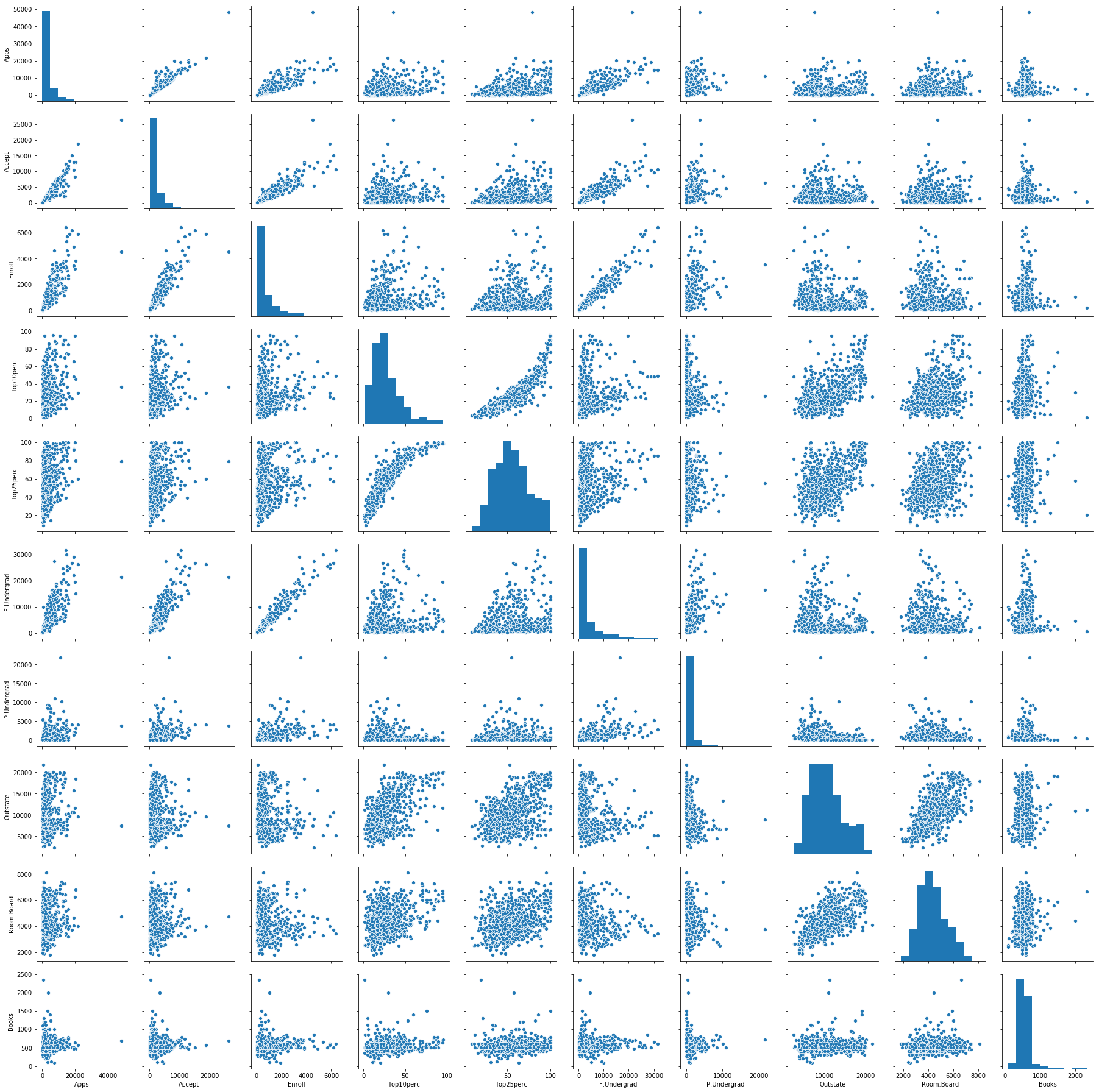
# produce a scatterplot matrix of the first ten columns or variables of the data.
import seaborn as sns

sns.pairplot(college.loc[:, 'Apps':'Books'])
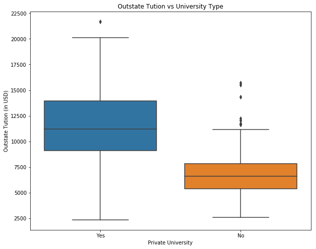
# produce side-by-side boxplots of Outstate versus Private.
import matplotlib.pyplot as plt

fig = plt.figure(figsize=(10, 8))
ax = fig.add_subplot(111)

sns.boxplot(x="Private", y="Outstate", data=college)
ax.set_xlabel('Private University')
ax.set_ylabel('Outstate Tution (in USD)')
ax.set_title('Outstate Tution vs University Type')
plt.show()
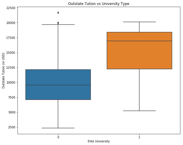
# Create a new qualitative variable, called Elite, by binning the Top10perc variable.
college['Elite'] = 0
college.loc[college['Top10perc'] > 50, 'Elite'] = 1
print("Number of elite universities are: " +str(college['Elite'].sum()))

fig = plt.figure(figsize=(10, 8))
ax = fig.add_subplot(111)

sns.boxplot(x="Elite", y="Outstate", data=college)
ax.set_xlabel('Elite University')
ax.set_ylabel('Outstate Tution (in USD)')
ax.set_title('Outstate Tution vs University Type')
plt.show()
Number of elite universities are: 78
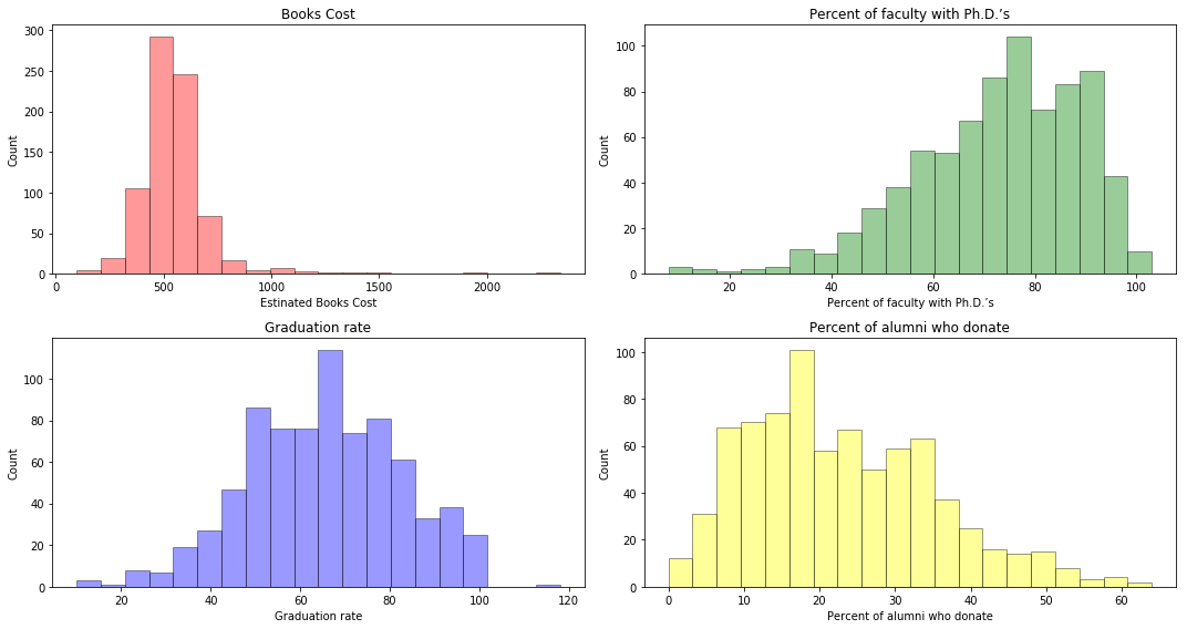
# produce some histograms with differing numbers of bins for a few of the quantitative vari- ables.
college.head()

fig = plt.figure(figsize=(15, 8))

ax = fig.add_subplot(221)
sns.distplot(college['Books'], bins=20, kde=False, color='r', hist_kws=dict(edgecolor='black', linewidth=1))
ax.set_xlabel('Estinated Books Cost')
ax.set_ylabel('Count')
ax.set_title('Books Cost')

ax = fig.add_subplot(222)
sns.distplot(college['PhD'], bins=20, kde=False, color='green', hist_kws=dict(edgecolor='black', linewidth=1))
ax.set_xlabel('Percent of faculty with Ph.D.’s')
ax.set_ylabel('Count')
ax.set_title('Percent of faculty with Ph.D.’s')

ax = fig.add_subplot(223)
sns.distplot(college['Grad.Rate'], bins=20, kde=False, color='blue', hist_kws=dict(edgecolor='black', linewidth=1))
ax.set_xlabel('Graduation rate')
ax.set_ylabel('Count')
ax.set_title('Graduation rate')

ax = fig.add_subplot(224)
sns.distplot(college['perc.alumni'], bins=20, kde=False, color='yellow', hist_kws=dict(edgecolor='black', linewidth=1))
ax.set_xlabel('Percent of alumni who donate')
ax.set_ylabel('Count')
ax.set_title('Percent of alumni who donate')

plt.tight_layout() #Stop subplots from overlapping
plt.show()
Q9. This exercise involves the Auto data set studied in the lab. Make sure that the missing values have been removed from the data.
auto = pd.read_csv("data/Auto.csv")
auto.dropna(inplace=True)
auto = auto[auto['horsepower'] != '?']
auto['horsepower'] = auto['horsepower'].astype(int)
auto.head()
| mpg | cylinders | displacement | horsepower | weight | acceleration | year | origin | name | |
|---|---|---|---|---|---|---|---|---|---|
| 0 | 18.0 | 8 | 307.0 | 130 | 3504 | 12.0 | 70 | 1 | chevrolet chevelle malibu |
| 1 | 15.0 | 8 | 350.0 | 165 | 3693 | 11.5 | 70 | 1 | buick skylark 320 |
| 2 | 18.0 | 8 | 318.0 | 150 | 3436 | 11.0 | 70 | 1 | plymouth satellite |
| 3 | 16.0 | 8 | 304.0 | 150 | 3433 | 12.0 | 70 | 1 | amc rebel sst |
| 4 | 17.0 | 8 | 302.0 | 140 | 3449 | 10.5 | 70 | 1 | ford torino |
(a) Which of the predictors are quantitative, and which are qualitative?
Sol: Quantitative: displacement, weight, horsepower, acceleration, mpg
Qualitative: cylinders, year, origin
(b) What is the range of each quantitative predictor?
print("Range of displacement: " + str(auto['displacement'].min()) + " - " + str(auto['displacement'].max()))
print("Range of weight: " + str(auto['weight'].min()) + " - " + str(auto['weight'].max()))
print("Range of horsepower: " + str(auto['horsepower'].min()) + " - " + str(auto['horsepower'].max()))
print("Range of acceleration: " + str(auto['acceleration'].min()) + " - " + str(auto['acceleration'].max()))
print("Range of mpg: " + str(auto['mpg'].min()) + " - " + str(auto['mpg'].max()))
Range of displacement: 68.0 - 455.0
Range of weight: 1613 - 5140
Range of horsepower: 46 - 230
Range of acceleration: 8.0 - 24.8
Range of mpg: 9.0 - 46.6
(c) What is the mean and standard deviation of each quantitative predictor?
auto.describe()[['displacement', 'weight', 'horsepower', 'acceleration', 'mpg']].loc[['mean', 'std']]
| displacement | weight | horsepower | acceleration | mpg | |
|---|---|---|---|---|---|
| mean | 194.411990 | 2977.584184 | 104.469388 | 15.541327 | 23.445918 |
| std | 104.644004 | 849.402560 | 38.491160 | 2.758864 | 7.805007 |
(d) Now remove the 10th through 85th observations. What is the range, mean, and standard deviation of each predictor in the subset of the data that remains?
temp = auto.drop(auto.index[10:85], axis=0)
temp.describe().loc[['mean', 'std', 'min', 'max']]
| mpg | cylinders | displacement | horsepower | weight | acceleration | year | origin | |
|---|---|---|---|---|---|---|---|---|
| mean | 24.374763 | 5.381703 | 187.880126 | 101.003155 | 2938.854890 | 15.704101 | 77.123028 | 1.599369 |
| std | 7.872565 | 1.658135 | 100.169973 | 36.003208 | 811.640668 | 2.719913 | 3.127158 | 0.819308 |
| min | 11.000000 | 3.000000 | 68.000000 | 46.000000 | 1649.000000 | 8.500000 | 70.000000 | 1.000000 |
| max | 46.600000 | 8.000000 | 455.000000 | 230.000000 | 4997.000000 | 24.800000 | 82.000000 | 3.000000 |
(e) Using the full data set, investigate the predictors graphically, using scatterplots or other tools of your choice.
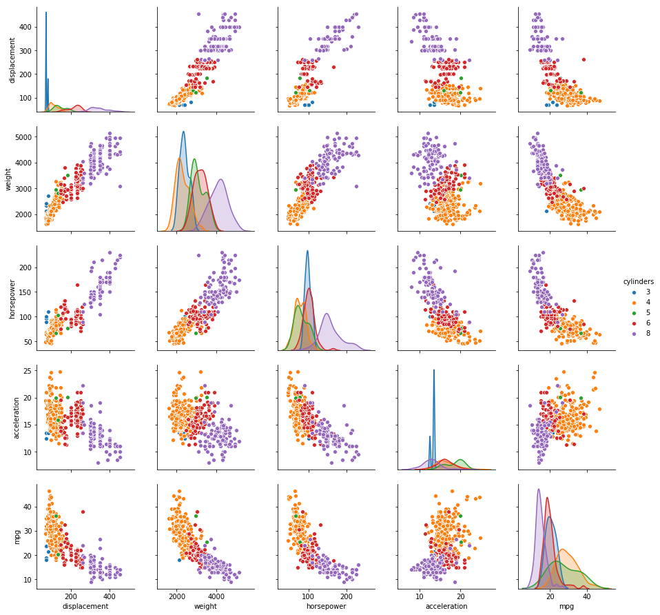
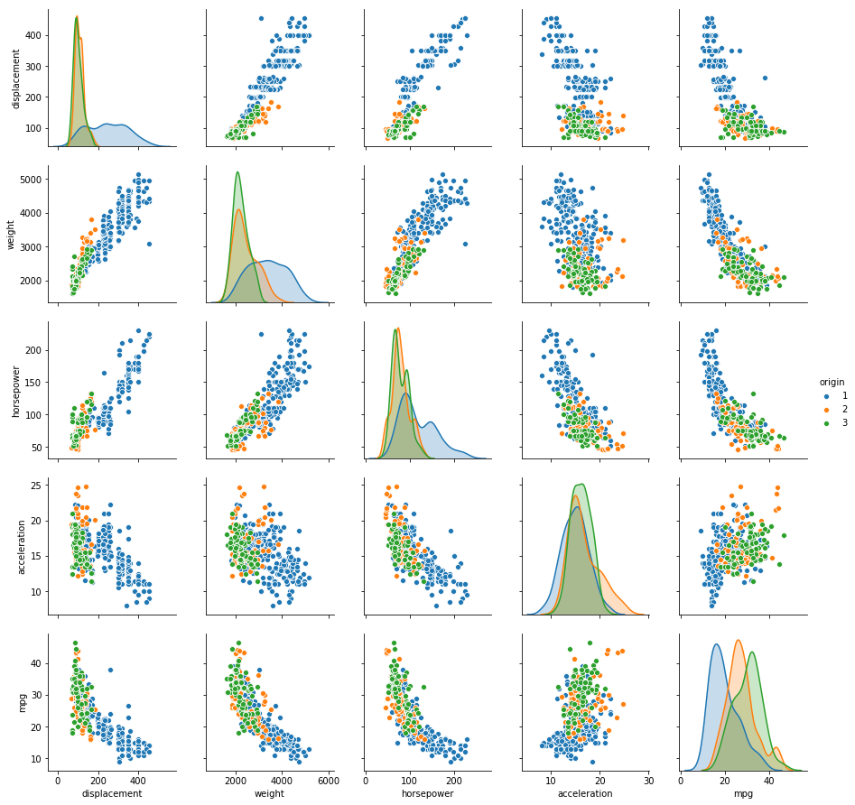
Sol: Two scatterplots of all the quantitative variables segregated by cylinders and origin is shown below. It is evident that vehicles with higher number of cylinders have higher displacement, weight and horsepower, while lower acceleration and mpg. The relationship of mpg with displacement, weight and horsepower is somewhat predictable. Similarly, the relationships of horsepower, weight and displacement with all the other variables follow a trend. Vehicles are somehow distinguishable by origin as well.
# Scatter plot of quantitative variables
sns.pairplot(auto, vars=['displacement', 'weight', 'horsepower', 'acceleration', 'mpg'], hue='cylinders')
sns.pairplot(auto, vars=['displacement', 'weight', 'horsepower', 'acceleration', 'mpg'], hue='origin')
(f) Suppose that we wish to predict gas mileage (mpg) on the basis of the other variables. Do your plots suggest that any of the other variables might be useful in predicting mpg? Justify your answer.
Sol: From the plot, it is evident that displacement, weight and horsepower can play a significant role in the prediction of mpg. As displacement is highly correlated with weight and horsepower, we can pick any one of them for the prediction. Origin and cylinders can also be used for prediction.
Q10. This exercise involves the Boston housing data set.
(a) How many rows are in this data set? How many columns? What do the rows and columns represent?
from sklearn.datasets import load_boston

boston = load_boston()
print("(Rows, Cols): " +str(boston.data.shape))
print(boston.DESCR)
(Rows, Cols): (506, 13)
Boston House Prices dataset
===========================

Notes
------
Data Set Characteristics:

    :Number of Instances: 506

    :Number of Attributes: 13 numeric/categorical predictive

    :Median Value (attribute 14) is usually the target

    :Attribute Information (in order):
        - CRIM     per capita crime rate by town
        - ZN       proportion of residential land zoned for lots over 25,000 sq.ft.
        - INDUS    proportion of non-retail business acres per town
        - CHAS     Charles River dummy variable (= 1 if tract bounds river; 0 otherwise)
        - NOX      nitric oxides concentration (parts per 10 million)
        - RM       average number of rooms per dwelling
        - AGE      proportion of owner-occupied units built prior to 1940
        - DIS      weighted distances to five Boston employment centres
        - RAD      index of accessibility to radial highways
        - TAX      full-value property-tax rate per $10,000
        - PTRATIO  pupil-teacher ratio by town
        - B        1000(Bk - 0.63)^2 where Bk is the proportion of blacks by town
        - LSTAT    % lower status of the population
        - MEDV     Median value of owner-occupied homes in $1000's

    :Missing Attribute Values: None

    :Creator: Harrison, D. and Rubinfeld, D.L.

This is a copy of UCI ML housing dataset.
http://archive.ics.uci.edu/ml/datasets/Housing


This dataset was taken from the StatLib library which is maintained at Carnegie Mellon University.

The Boston house-price data of Harrison, D. and Rubinfeld, D.L. 'Hedonic
prices and the demand for clean air', J. Environ. Economics & Management,
vol.5, 81-102, 1978.   Used in Belsley, Kuh & Welsch, 'Regression diagnostics
...', Wiley, 1980.   N.B. Various transformations are used in the table on
pages 244-261 of the latter.

The Boston house-price data has been used in many machine learning papers that address regression
problems.

**References**

   - Belsley, Kuh & Welsch, 'Regression diagnostics: Identifying Influential Data and Sources of Collinearity', Wiley, 1980. 244-261.
   - Quinlan,R. (1993). Combining Instance-Based and Model-Based Learning. In Proceedings on the Tenth International Conference of Machine Learning, 236-243, University of Massachusetts, Amherst. Morgan Kaufmann.
   - many more! (see http://archive.ics.uci.edu/ml/datasets/Housing)
(b) Make some pairwise scatterplots of the predictors (columns) in this data set. Describe your findings.
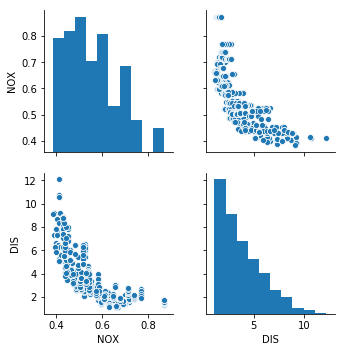
Sol: Pairwise scatterplot of nitric oxides concentration vs weighted distances to five Boston employment centres shows that as distance decreases, the concentration of nitrous oxide increases.
df_boston = pd.DataFrame(boston.data, columns=['CRIM', 'ZN', 'INDUS', 'CHAS', 'NOX', 'RM', 'AGE', 'DIS', 'RAD', 'TAX',
                                               'PTRATIO', 'B', 'LSTAT'])

sns.pairplot(df_boston, vars=['NOX', 'DIS'])
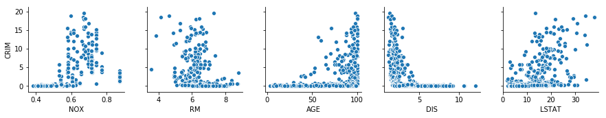
(c) Are any of the predictors associated with per capita crime rate? If so, explain the relationship.
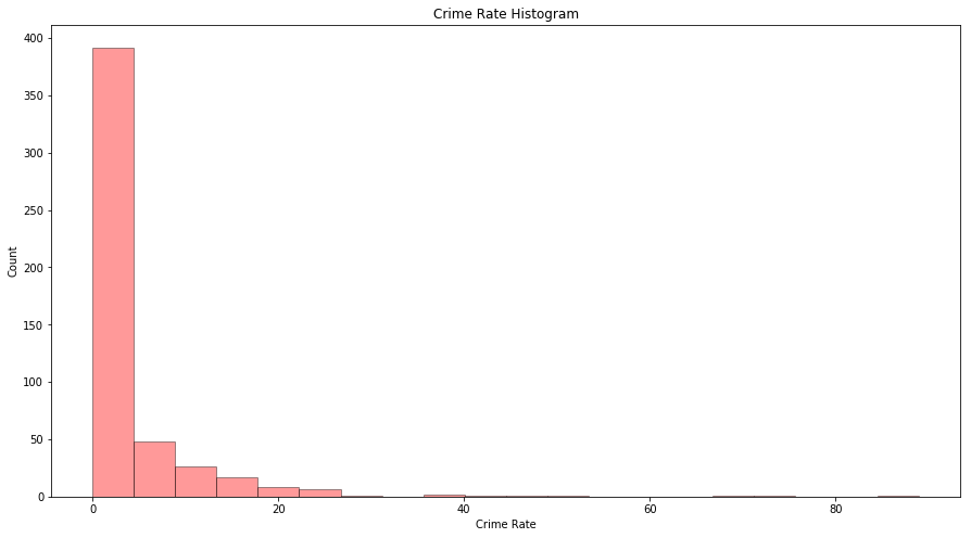
Sol: As most of the area has crime rate less than 20%, we will analyze the scatterplot for those areas only.
fig = plt.figure(figsize=(15, 8))

ax = fig.add_subplot(111)
sns.distplot(df_boston['CRIM'], bins=20, kde=False, color='r', hist_kws=dict(edgecolor='black', linewidth=1))
ax.set_xlabel('Crime Rate')
ax.set_ylabel('Count')
ax.set_title('Crime Rate Histogram')
Text(0.5,1,'Crime Rate Histogram')
temp = df_boston[df_boston['CRIM'] <= 20]
sns.pairplot(temp, y_vars=['CRIM'], x_vars=['NOX', 'RM', 'AGE', 'DIS', 'LSTAT'])
(d) Do any of the suburbs of Boston appear to have particularly high crime rates? Tax rates? Pupil-teacher ratios? Comment on the range of each predictor.
print("Count of suburbs with higher crime rate: " + str(df_boston[df_boston['CRIM'] > 20].shape[0]))
print("Count of suburbs with higher tax rate: " + str(df_boston[df_boston['TAX'] > 600].shape[0]))
print("Count of suburbs with higher pupil-teacher ratio: " + str(df_boston[df_boston['PTRATIO'] > 20].shape[0]))
Count of suburbs with higher crime rate: 18
Count of suburbs with higher tax rate: 137
Count of suburbs with higher pupil-teacher ratio: 201
(e) How many of the suburbs in this data set bound the Charles river?
print("Suburbs bound the Charles river: " + str(df_boston[df_boston['CHAS'] == 1].shape[0]))
Suburbs bound the Charles river: 35
(f) What is the median pupil-teacher ratio among the towns in this data set?
print("Median pupil-teacher ratio is: " + str(df_boston['PTRATIO'].median()))
Median pupil-teacher ratio is: 19.05
(h) In this data set, how many of the suburbs average more than seven rooms per dwelling? More than eight rooms per dwelling?
print("Suburbs with average more than 7 rooms per dwelling: " + str(df_boston[df_boston['RM'] > 7].shape[0]))
print("Suburbs with average more than 7 rooms per dwelling: " + str(df_boston[df_boston['RM'] > 8].shape[0]))
Suburbs with average more than 7 rooms per dwelling: 64
Suburbs with average more than 7 rooms per dwelling: 13