Chapter 1: Introduction
Wage Data
import pandas as pd
import matplotlib.pyplot as plt
import seaborn as sns

wage = pd.read_csv("data/Wage.csv")
wage.loc[df['education'] == '1. < HS Grad', 'education'] = 1
wage.loc[df['education'] == '2. HS Grad', 'education'] = 2
wage.loc[df['education'] == '3. Some College', 'education'] = 3
wage.loc[df['education'] == '4. College Grad', 'education'] = 4
wage.loc[df['education'] == '5. Advanced Degree', 'education'] = 5
wage.head()

fig = plt.figure(figsize=(15,8))

ax = fig.add_subplot(131)
sns.regplot(x="age", y="wage", color='#D7DBDD', data=wage, order=2, scatter_kws={'alpha':0.5},
            line_kws={'color':'g', 'alpha':0.7})
ax.set_xlabel('Age')
ax.set_ylabel('Wage')
ax.set_title('Wage vs Age')

ax = fig.add_subplot(132)
sns.regplot(x="year", y="wage", color='#D7DBDD', data=wage, order=1, scatter_kws={'alpha':0.5},
            line_kws={'color':'g', 'alpha':0.7})
ax.set_xlabel('Year')
ax.set_ylabel('Wage')
ax.set_title('Wage vs Year')

ax = fig.add_subplot(133)
sns.boxplot(x="education", y="wage", data=wage)
ax.set_xlabel('Education')
ax.set_ylabel('Wage')
ax.set_title('Wage vs Education')

plt.show()
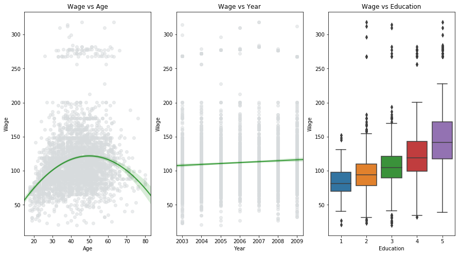
The Wage dataset consists of data containing income, age, year and education level of different individuals. As shown in the above figure, it can be interpreted that wage increases with increase in age upto 60 years and decreases afterwards (but deviation is significant). Wage increases linearly with the year (but deviation is significant). The people with higher education level tends to have higher wage. So ideally if we want to predict wage, we should consider the non-linear relationship between wage and age and take into consideration the effect of year and education level as well. This process involves predicting a continuous or quantitative value and is often referred to as a regression problem.
Stock Market Data
Smarket = pd.read_csv("data/Smarket.csv")

fig = plt.figure(figsize=(15,8))

ax = fig.add_subplot(131)
sns.boxplot(x="Direction", y="Lag1", data=Smarket)
ax.set_xlabel('Today\'s Direction')
ax.set_ylabel('Percentage change in S&P')
ax.set_title('Yesterday')

ax = fig.add_subplot(132)
sns.boxplot(x="Direction", y="Lag2", data=Smarket)
ax.set_xlabel('Today\'s Direction')
ax.set_ylabel('Percentage change in S&P')
ax.set_title('Two Days Previous')

ax = fig.add_subplot(133)
sns.boxplot(x="Direction", y="Lag3", data=Smarket)
ax.set_xlabel('Today\'s Direction')
ax.set_ylabel('Percentage change in S&P')
ax.set_title('Three Days Previous')

plt.show()
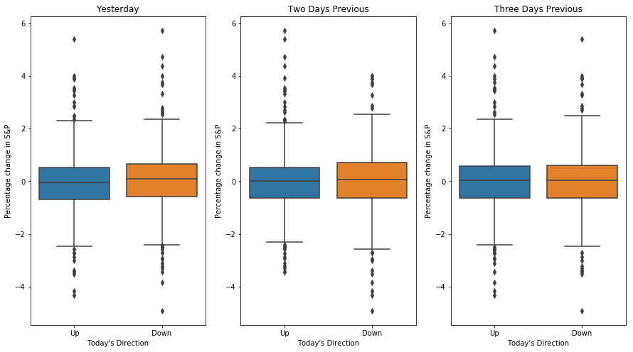
The dataset consists of daily movement of S&P stock over a 5 year period. The goal is to predict that whether the index will increase or decrease on a given day using the past 5 days percentage change in index. Here the statictical modeling involves predicting that whether the performance will fall into the Up or Down bucket. This is known as a classification problem.
The first plot in the figure shows the movement based on yesterday’s data. The two plots look almost identical, suggest- ing that there is no simple strategy for using yesterday’s movement in the S&P to predict today’s returns. The remaining panels, which display box- plots for the percentage changes 2 and 3 days previous to today, similarly indicate little association between past and present returns.
Notation and Simple Matrix Algebra
- $n$: number of distinct data points
- $p$: number of variables that are available for making predictions
- $x_{ij}$: $j^{th}$ variable of $i^{th}$ observation
- X: denotes $n \times p$ matrix whose (i, j)th element is $x_{ij}$–
- $x_i$: vector of length $p$ containing the $p$ variable measurements of $i$th observation (rows of X)
- $x_j$: vector of length $n$ (columns of X)
- $y_i$: denotes the $i$th observation of the variable on which we wish to make predictions
- $Y$: set of all $n$ values of $y_i$s
For matrix A and B, the (i, j)the element of the product AB is given as:
$$(AB) _{ij} = \sum _{k=1}^{d}a _{ik}b _{kj}$$